Mack Smart
Cohort 1

Studio D
Analyzing Get Out
1. Two elements of design (line, shape, form, space, color, value, texture)
2. Three Elements of 4D
3. Three Principles of 4D
Get Out. Jordan Peele. 2017.
Analyzing Get Out
1. Two elements of design (line, shape, form, space, color, value, texture)
2. Three Elements of 4D
3. Three Principles of 4D
Get Out. Jordan Peele. 2017.
Kingslayer
When their lover is murdered due to an exposed affair, a blood-thirsty jester gives hints about inciting revenge via the same method.

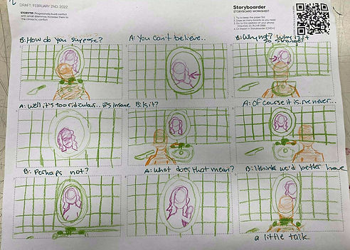

Thaumatrope
SMAI Mock
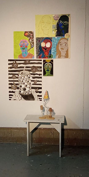

Discuss your logic and rationale for your exhibition layout.
While not intended, I decided to give make the exhibition easy for the eyes. Viewers could look from the first piece and go down until they landed their eyes on the smaller pieces. I did not think about how much color I added here, as I picked some of my best work from the year (plus the two pieces that were accepted into the ASAC).
Identify and discuss the two best artworks in your portfolio.
In my opinion, the two best works in this portfolio are Seasons Change (still thinking of the name) and Begiak Guztiak Ikusi (Eye See All).
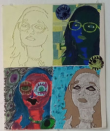
Seasons Change uses a lot of colors to help convey the emotion of each panel. With One: Content, light lime green is used around the lines made of hot glue. They’re there to represent the calm before the storm. Since green is my favorite color, I thought lightening it up and adding it to this specific area of the piece would not only make it look finished but help kick in the idea of the next three panels. Two: Mild Panic consists of only blues and greens. The greens get darker as the panic begins to set in and the blue comes through to help signify the hell that is about to happen. Now, there is glitter around the eyes. This first started to help show the eyeshadow, but it became more than that simply for the fact that the panic can be most seen in my eyes. The two eyes around my face also help to signify this. Three: Full Force not only shows the previous blues and greens but now reds, oranges and purples are introduced into the mix. Red is often thought of as a panic color as much as a color to signify anger, so I really wanted to play into this fact and make the skin tone match it. Darker shadows of blues, oranges, and greens were added to not only give the piece more depth but to also help accurately show how everything ends up so muddled when the panic attack is in full force. The eyes become more apparent - they surround my head - and they come to show the paranoia I have with the thought that people around me are watching me break down even though the panic attack is usually internal. In this panel, the eyes become the emphasis. They’re different, newly added, and darker than the actual composition. Four: Finally Free is the feeling after a panic attack. The light blue signifies the electric feeling that’s there once it’s over. The black and white of the newspaper print help to kick in the fact that once it’s over and everything is out, I feel empty. There’s nothing else to express and I know I’ll go about the rest of my day in a weird focus, but a highly disassociated state.
Begiak Guztiak Ikusi is a piece that I created at the end of the fall semester to help come to peace with events that happened when I was a child. Granted, it turned into more of a piece of vent art, but I believe it is this helps sell the emotional impact it would have on others who identify what it actually means. During this critique, it was fun observing classmates find new details and try to put the narrative together. Everyone, including myself, was drawn to the can covered in eyes. This was the purpose, as I wanted the focal point to help hit home with a bit of creepiness and a feeling of disgust when the viewer looks at the can.
A piece that needs a lot more work is Triple Threat, which contains three varying mushroom sculptures. The problem lies more within Pretty Poison, the tallest and most colorful mushroom. I had wanted to twist the stem to where it had this almost whimsical feeling. However, this did not happen which has left it structurally unstable. I think making the stem thicker would help with the way the mushroom shakes when you touch it. Alleviating the weight on the cap would also help with some of this, as well.
What is your presentation missing?
I need to work on presentation practice. When presenting works for the SMAI I don't need to stutter or trail off while I think of what a good thing to say would be. Spacing my work out would make it look a bit better as well as adding some charcoal pieces. The addition of charcoal pieces would help balance out the intense color of the exhhibit.